Wednesday, 19 October 2011

Book Binding

http://www.komar.com/Images/categories/Book%20Binding.png

While putting my menu project together the biggest problem that I had across was  binding.
First I was going to use a large staple like clip that would go through all of the pages much like how a duo tang is put together. This turned out to be too over powering over my simple cover of my menu. The next idea I tried was saddle stitching. This turned out to be the easiest and quickest method of getting a clean look and was also affordable.

If I had looked into different binding methods earlier or had more time to try different methods I could have used one of the following:

PAPERBACK
Paperback book binding is another way to bind a book. All novels, some comic books, some textbooks etc, basically any paperback needing binding, have paperback binding. The term "paperback" means that the covers of books are like paper. They are thicker than the inner pages to give the feeling of cover, but don't offer the same protection to pages as a hardcover book does.

Paper back binding is fairly simple, and you can bind paperback books at home after learning the process. Many people have found this useful and use this book binding style to do it by themselves.

Many authors who want to self publish but are not able to afford publishing houses, as well as book binding hobbyists who want to bind their own books, are using the paperback book binding method to bind their own books at home. Paperback binding is one of the more simple dyi book binding methods.

HARDCOVER
Another commonly seen binding is hardcover binding. It is a great way to protect books and help them to last much longer. You can see hardcover book binding in encyclopedias, thick books, diaries, and many other books. In hardcover books, a thick cover is attached with the help of special glue.

Hardcover binding can also be done at home but it requires more effort. The different steps involved are making signatures, poking holes in the signatures, sewing (probably the hardest part of this style of book binding), making the cover, and finally attaching the cover to the stack of signatures.

The result of this style of binding is well worth the effort, as the final product is beautiful and will protect your projects.

YOTSUME TOJI
The Yotsume Toji is a very simple Japanese Bookbinding method. The name may sound as if it is a very hard type of binding books. But it simply means four holes. So if you hear about "4 holes book binding," it's basically the same style of book binding method as the the Yotsume Toji.


In this binding four holes are made at one edge of the book. Then it is sewn in a particular fashion to get the Yotsume Toji Binding. It is good for repairing books and to create your own small books.

COPTIC
Coptic binding is one of the oldest type of bookbinding which was practised by the Copts in Egypt. It is also simple and you can try it now itself.

In this binding there is no spine because of which the book can be folded so that both the covers touch each other and it will not be damaged.

Two covers are placed above and below the papers and it is sewed through one edge. There are different methods of sewing. Some of them are easy while others are difficult. I always advice to start with easy ones and then go for the difficult ones.

THERMAL
Thermal binding is one of the recently developed type of bookbinding. In this method lose pages are secured or joined with a strip of plastic or tape and then fused with heat. It is similar to the perfect binding method where the pages are glued together.

This method is used mainly for office documents and presentations. It gives a neat and sturdy look to the finished books. Sometimes it is also referred to as Velo binding.

BELGIAN
The "Secret Belgian Bookbinding" is a method of bookbinding that uses a very unique style of exposed sewing to bind a text block to the cover boards and spine, creating an outside stitching pattern that is unmatched. The cover is usually made using three separate pieces: the front cover, the back cover, and the spine piece.

The covers are attached by sewing thru holes on the cover boards and passing over and then under the spine piece. The sewn text block is attached when the threads that pass under the spine piece also pass through the stitches on the spine of the main text block.

The spine piece is held in place only by these threads passing over and under it. It creates an interesting thread pattern on the cover and it is a very sturdy binding that allows the book to open completely flat.

The true origin of this binding style is not certain but may have been developed between the fourteenth and sixteenth centuries in Belgium. It was probably some bookbinder's "secret method" and therefore was not well known until it was rediscovered centuries later.
http://classes.dma.ucla.edu

Information from:http://www.squidoo.com/waystobindabook

Interviews With Former Students from Conestoga

In order to better understand the benefit of networking and getting your name out there as a student, who better to ask than former students that now have a job at local design firms.
I emailed three former students and was lucky enough to get two of them to respond.
These were the questions asked:
1. Where did you do your co-op in 3rd year?
2. How did you discover the firm?
3. How did the work there benefit you?
4. Did you reach out to any design firms throughout your schooling? If so which ones and how did they help?
5. Where are you working now?
6. How did networking throughout school get you there?
7. Personally, what do you think the benefits of working in a local design firm are?

The first person that responded was Madeline Caesar 
1. For my placement in 3rd year I was working at in house at the Record, for Grand River Shows (http://www.grandrivershows.com/) so I wasn't working on like the actual paper, its a small department they have which puts on consumer shows as another form of revenue, in addition to the paper. So what I was mainly doing was promotional materials and information pieces for their shows.
2. Um, well obviously I knew about the Record being from this area, I think John had mentioned that they wanted people there for placements and I wasn't totally sure where I wanted to go for placement so he suggested it.
3. It benefited me a lot in the sense that it was actual work experience, as opposed to personal or school work. So, where in school you can kinda work at your own pace and decide what you want to get done first, when you're actually working for someone they're the ones deciding what you're working on all day and whats priority. Also, you're not just designing for yourself so in school you want it to look good but also for it to reflect your style and your tastes whereas in the work world its all about what the client wants and likes and what will appeal most to their demographic. So I think that was the main benefit for me with the co-op, to get my head around the work flow and the process and how it was different from school.
4. Nope. I think its a good idea but I didn't while I was in school, after I graduated I was planning on contacting some local firms and either sending them a copy of my portfolio or asking to meet with them for a review.
5. I'm working at zfactor. Its a small marketing studio with an emphasis on web design. So the majority of what we do is for web but we still have several client that need print work and we do a lot of branding and identity stuff as well. Here's the website www.zfactor.ca, the design's actually not great but they're in the process of updating it, I think the new site will be up in the next couple weeks, but that should give you an idea of some of the work they've done anyway.
6. So I got an interview there because my uncle is friends with the owner's brother and it worked out that he had mentioned they were looking for someone and my uncle let them know I was looking for a job so he called me an set up an interview. So it wasn't directly through networking with school, but we did have classes about networking.
7. For me I didn't really want to move to a bigger city right now and I think this area is good for design because its big but its not huge and there's a lot of investment in technology and innovation so new companies are going to start out here and existing companies will be growing. There will be a lot of opportunity for design as far as branding and communication for local companies. Waterloo is "the most intelligent community" so i think companies are more willing to embrace the value of design.

The second person that responded was Melissa Waggler

1. My co-op was at Two Blonde Chicks, Inc. in Kitchener
2. Two Blonde Chicks was started by 2 grads (Jolene MacDonald & Julie Knowles) from the Conestoga program, so I knew about them since I started in 1st year. I met them in my 3rd year when my class participated in the Create-a-thon that the Two Blonde Chicks organized, and Julie was the creative director for my group. When it was time to pick work placements John suggested that I go there.
3. Working there was great, it really showed the difference between school and working at a studio, especially with deadlines. It was also good to see how things work in a studio, and because it is such a small studio I got to see lots. 
4. No, I didn't.
5. I'm working at Two Blonde Chicks, they hired me back in May when I finished school.
6.The Create-a-thon and the 3rd year portfolio reviews were the two times I interacted with the Two Blonde Chicks, and those helped lead to my work placement there, which then lead to them hiring me. 
7. I like working at a local studio because it promotes good design among the smaller local business who wouldn't have any design if they had to go to the big studios in Toronto. I also like the close-knit design community that is here in KW, with all the Conestoga grads that are here.
 
From this I learned not only all that I asked them but as well when asking people to help you and answer questions you have to allow for a few weeks time for them to answer. This made me realize that although I may feel like I'm busier than everyone else this isn't necessarily true, both of these people didn't have a spare half an hour to answer my questions for 2 weeks. As well I learned that if you never ask for help or reach out, you'll never get it.

Wednesday, 12 October 2011

Brandversations

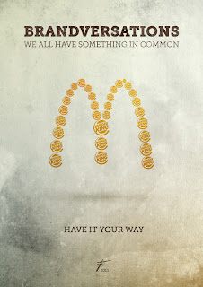
Although I've seen these brandversations on multiple websites and blogs, they catch my attention every time. To me this series of designs is much like Andy Warhol's creations with Madonna and Campbell's Soup Cans. Stefan Asafti, a Romanian designer, used well known icons of the twenty first century as intriguing works of art. Each piece incorporates opposing leading brands logos, to make up their logo and their moto. These brandversations encourage the viewer to question their loyalty to the brand and enjoy the rivalry between the top competitors. What I like most about these are that they take something so simple that uses minimal colour and detail to get the message across.


images and information from: http://www.graphicdesignblog.org/mindblowing-brandversations-famous-logos/

Thursday, 6 October 2011

Under a Miscroscope

At a first glance these pictures look like rocks, or clothing patterns or abstract imagery. What these images are actually pictures of are single droplets of different kinds of alcohol at 1000x magnification. Each drop takes roughly 3 months to dry out on a microscope slide and to get the alcohol to dry properly can take up to 200 attempts. This process was created by bevshot who sells the photos and other merchandise with these patterns online. They do this to alcohols such as beer, liqueur, mixers, and cocktails.Each print cost between $38 and $200 depending on the size of the print.


To find out more about bevshots view their video:
www.youtube.com/watch?v=OKzwL8k47O4&feature=player_embedded
or go to their website: bevshots.com

Interview with the Makerie

While on the Makerie's website I stumbled across one of their projects which was a series of birds made of paper and other found objects. Immediately I was drawn to them and needed to know more, so I emailed the ladies that make them:

1. Why were birds chosen as the main subject matter?
We never actually 'chose' birds; it started with a project we did for Falkiners' Papers (The Great Omar, where a peacock seemed like the best way to display their amazing range of papers), and since then we seem to keep coming back to them.. birds can convey a great sense of mood or narrative through their stature and colouring, the shapes and variety of their feathers is really important too. There's something about the methodical cutting and glueing of feathers as well that seems to have us hooked

2. How would you describe your process of making these birds?
As with most things we do, 'a lot of research, a lot of drawing and a lot of talking, some arguments and a lot of agreements' - we generally research the bird we need to make as exhaustively as we can, and then basically get stuck in. It's a fairly natural process for us, and although parts of it can be frustrating, the challenge is always worth it!

3.How long approximately does each one take?
The Great Omar took about 2-3 weeks in total, including the prototype (which we don't always make); a lot depends on the size of the birds and the complexity of their poses. We often spend more time working out 'which direction it should be looking' than actually making them! The Fabriano Collier parrot for instance took a week, but most of that time was spent trying to get the balance, the wings and the tail looking right (and angry)!

4. What other kinds of work do you do and which is your favourite?
At the moment we're open to all sorts of things; window displays, editorials and campaigns seem to be happening a lot, and we really enjoy them. Every project is different and we learn from each one; often the most difficult jobs end up teaching us the most (we learned a lot about patience from using fishing wire, for example...!). The challenge of reproducing objects in paper is always satisfying, but it seems like stylising things in a way of our own is ultimately the most fun.

5.What kind of schooling was undertaken before these projects?
We actually both studied Graphic Design :) We also realised fairly early on that we preferred making things rather than printing them, and we were lucky enough to be on a course that welcomed initiative and let us do things slightly differently. We only started working together on The Makerie about a year after uni though, when we realised we could actually make a living from doing what we enjoyed the most.

6. What advice do you have for aspiring designers?
Learn as much as you can from the business and keep the spirit you had as a student - it seems like the hardest thing when you 'go out into the real world', as people keep saying, is to maintain the enthusiasm and the spark that you have when you're studying. It's easy to get discouraged, but ultimately sticking at things really pays off! Oh, and if you're doing something no one else is, do it even more :)


Hope that helps! And best of luck with your course :)
All the best from London and Milan,

Julie & Joy


Wednesday, 5 October 2011

All That Glitters is.. Art

"Glitter is the herpes of craft supplies"-Demetri Martin.
Clearly Theresa Himmer had never heard of this saying. Theresa Himmer is a Danish/Czech designer that focuses much of her art in urban lifestyle. She designed 3 different glitter sequin displays that are displayed on buildings in Iceland. These creations are made of plywood, thousands of sequins and plastic and the largest is 20.9 m squared. Each sequin was pinned by hand which took the hands of many. The series includes a mountain, glacier and volcano, all of which glimmer in the light when exposed to wind and other elements.


www.yatzer.com

Tuesday, 4 October 2011

Taking Type to the Next Level

If some people spend half their lives creating a typeface imagine sewing it after.
That's exactly what was done at Zim and Zou Studio. Each letter took a painstaking 6 hours to weave and altogether 500m of thread was used to create the typeface. Their newest creation made this year, Weave Type 2 is created of triangle pieces of different segments of thread. This is based off their Weave Type font created in 2010 where one single piece of white thread was woven around nails.

http://vimeo.com/20331048
www.behance.net/

What Makes a good Photograph?

What makes a good photograph?

1. Composition- The starting point behind every stunning picture is a solid structure, keep the rule of thirds in mind while shooting.

2. Detail- This keeps the viewer involved at looking at the picture and catches their attention for a longer period of time, the detail should be kept away from the edges of the photograph as to draw the eye in, not out.

3.Colour- Depending on what mood you want the viewer to feel the colours should reflect this as well as work together.

4. Lighting- This ensures the photo is exposed properly and everything you want to be seen can be seen.

5.Focal Point-There should be visual hierarchy and that area should be in focus.

6. Depth- Depending how much of your picture you want in focus depth plays an important role in what you want to be seen.

7.Lines-Subconsciously lines will draw your viewers eye directly where you want it to go in a good photograph.

8.Perspective- Do something different and capture the subject matter from a different angle to make the photo more appealing.

Research from:
While browsing through pictures on the internet I came across these photographs that I believe to be good photography:


 images from:dis-play.tumblr.com
pinterest.com/pin/250927071
pinterest.com/pin/208769567

Monday, 3 October 2011

Eyelight

Eyelight Inc.

38 Bridgeport Road East
Waterloo, Ontario

Debbie Repke on Local Design Firms:
1.What kind of work does your firm do? Full Service Marketing Agency
2. What major projects has your studio been involved in? Branding, Promotions, Packaging, Product Launch, Campaigns  etc.
3. Do you find the field of work your in to be a fast paced environment? Absolutely!
4. How many people are employed at your studio? 11
5. In your opinion, what is the best part of your job? Learning something new every day, being creative and being with creative people,  deadlines and challenges
6. What advice do you have for aspiring designers? Work hard, challenge yourself, learn all you can, ditch a ‘diva’ attitude and be humble – you have a lot to learn. Listen well.
Don’t be afraid to join in with your ideas. Take risks – they will pay off! Love what you do – if you don’t, it’s just a job. If you do – it’s a passion and it’s never work!
http://www.eyelight.com/contact

3 cool containers

Milk and cookies, tea and cookies, coffee and cookies, no matter what you pair your cookies with this mug can accommodate it all. $18 will get you this mug that is perfect for snack time. The mug can hold up to 14oz and the cubbie can hold 2 average sized cookies, just the right amount to moderate how much you eat. 
design don't panic.com
Your pet fish will never get bored of his surroundings with this bowl. Although this bowl will set you back $140, it can hold 2.5 gallons and gives your scaly friend a well designed home. Made By Gaia & Gino.
randommization.com

 Soggy cereal is a thing of the past. The Obol uses the "swoop and scoop" which allows you to control the amount of cereal that goes into your milk. This bowl can also be used for pairs such as chips and dip or soul and crackers. This container features a handle at the bottom, non slip grip rim, is dishwasher safe and is unbreakable. You can halve all of this for 20 a bowl.
obol.co

Sunday, 2 October 2011

A Good Designer...

Logo Design Love:
Good designers never lose curiosity
“Becoming a good designer is, in my mind, directly related to one’s curiosity and willingness to work. If you keep asking questions and deliberately practicing your craft, you get better. It’s that simple. So when it feels difficult and you want to scream, grab a pencil and a big blank sheet of paper, and just start drawing. With each iteration you’re closer.”

How Good Designers Think:
Good designers like observing
"You and I could walk down the street together and look at the same things, but I'd SEE ten times more than you would."- Paul Smith

My Ink Blog:
Good designers explore the unexplored
"A great designer takes on clients that challenge them to reach beyond their comfort zone, and dare into new territories and unexplored landscapes. They welcome feedback and use those critiques to further hone their creative skills and efforts. A great designer does not consider themselves to be great, as much as they see themselves as successful with a gallery of interesting and varied work. You see they are always striving for more and pushing forward, knowing not that they are great, but just that they are designers."

Clmt:Good designers know their target audience
"… specific skills do not make a good designer. … Effective design relies on understanding the audience and using this knowledge to communicate how your website or product works. … Knowledge of areas like user experience, interaction design and psychology help the designer understand the when and the why, and this is the sort of knowledge that isn’t tied down to specific techniques—the sort of knowledge that can be applied in a wide range of contexts and industries. "

Mcdezigns:
Good designers are level headed
"I want to work with someone that has seen and made so many mistakes that they have an ever-present sense of the fragility of any design. Leave egos and negativity at the door. One of us is not smarter then all of us. Happiness can be derived out of sharing. Sharing can give you feedback to improve."

Saturday, 1 October 2011

Art Installation Pavilions

As part of an exposition in Shanghai China entitled " better city, better life" as series of pavilions were installed in Bailianjing Park. This was the perfect place for an installation due to the fact of how widely used parks in Shanghai are. They are not only used as recreation, gathering and relaxing but people use these parks as a place to drink tea, do tai chi and play games. The pavilions are brightly coloured and accompanied by wind turbines that supply the pavilions with their necessary source of electricity. At night the wind turbines allow the installation to be lit for all to see.


research from:http://www.contemporist.com/2011/09/08/pavilions-in-bailianjing-park-by-taranta-creations/#more-35514image from:http://www.contemporist.com/wp-content/uploads/2011/09/pavilions_080911_03.jpg