Thursday, 15 March 2012

Hot Can

The Hot Can from the outside looks like any other canned food item, but it's what's inside that counts. When punctured water mixes with limestone which produces heat. After 8-12 minutes the canned for is ready to enjoy. Although Hot Can has been producing this product for almost 30 years, it has recently re-branded it's can and now has a variety of different foods such as vegetarian and halal options. Not only does this can heat its self but it stays hot for up to 45 minutes. It has a self life for up to 5 years and its durable can can withstand harsh conditions. Recyclable and cost effective this is the perfect solution for a hungry design student stuck at school all day. What this can was originally designed for was survival situations such as military or natural disasters.


For pictures and more information visit Hot Cans website at:http://www.hotcan.com/about-hotcan/why-hotcan/

eco-PERCH


The eco-PERCH is a sustainable hideaway that takes only 5 days to build and can last up to 15 years. This housing unit is ideal for the private business owner that wants to get away but doesn't want to work out of a caravan. It could also be used for hotel or just for a home away from home. What makes the eco-PERCH sustainable is its use of photovoltaic solar energy, a composting toilet, rainwater harvesting system and a methanol fuel cell. All of this is contained within a 6m x 8m space. The entire frame of the building is made from wood and has a roof surface covering the entire outside.
As seen in the floor plan, the eco-PERCH can sleep four and includes a kitchen and a washroom. This unit can be installed virtually anywhere, in a forest, amongst the trees or anywhere imaginable. The eco -PERCH was designed by Blue Forest, an architectural firm in the UK that specializes in tree houses. It will be launched at a convention this May with pricing between 80, 000-95, 000 USD.
Images from:http://www.gizmag.com/eco-perch-tree-houses/21669/pictures

Coffee Cup Stain Painting


Hong Yi is a 26 year old Malaysian artist that has recently caught the public's eye when she created a portrait of Taiwanese star Jay Chou made of coffee stains.
 To watch Hong Yi, aka OhiseeRed paint with a coffee cup visit this link Jay Chou Portrait
Red's painting was inspired by a song where it starts with lifting a coffee cup off of a saucer. This is also how her video starts. Through the song it goes through a story of a girl traveling in time and falling in love with Jay Chou. Her coffee portrait portrays this through the tones of the painting. This portrait took 12 hours to complete and proved itself quite the challenge. Depending on how concentrated the coffee was it could bleed too much or not enough into the paper. As well since it was made of coffee, each ring is a permanent mark.
Yi has also done paintings with other objects such as a basketball to make a painting of Yao Ming.
Pictures from:http://sweet-station.com/blog/2012/03/coffee-stain-portrait/

Saturday, 10 March 2012

Inspiration

This biggest project this year in packaging is the package of nothing. To start this project I visited http://www.flickr.com/photos/miadcommunicationdesign/sets/72157615594727916/ to see what other students had done for this same assignment. From there I brainstormed ideas of "nothing"that could be put into packages.
This is the list that I came up with.
cooties
intuition
motivation
luck perseverance
reassurance
voices inside your head
long arm of the law
a taste of your own medicine
personal bubble
chastity
water from the fountain of youth
 social life

After creating a list of possible items to package I narrowed it down to cooties or a taste of your own medicine. After looking into how I would package each I decided to go with a taste of your own medicine. I then began to brainstorm ideas of the types of packing I could put the "medicine" in.
This is the list I came up with:
pill bottle
blister pack
cough syrup package

The type of package that I thought would work the best would be a cough syrup package because cough syrup tastes bad, just like a taste of your own medicine.

The tone of my package is sarcastic and therefore uses witty sayings in place of medical terms. For example for the active ingredients instead of being medicinal I put traits such as pessimism, over confidence, bossiness, arrogance ect. It also will include information in the drug facts such as "Stop use and ask a doctor if attitude does not go away, if behaviour worsens or persistent feeling of depression."
I then found a die line of a cough syrup box and began to map out where the different information would go. I also researched different packages that the design would be similar to a cough syrup package. These are a few of the ones that I am taking inspiration from.


From here I am going to take the inspiration from these packages and create the finalized version of my own.
pictures from:lovelypackage.com

Wednesday, 7 March 2012

Biodegradable Urn

Death, a sensitive subject that most designers stray from, Gerard Moline has tackled this and created a biodegradable urn that goes back into the ground and plants a tree. It is made from coconut shell, compacted peat and cellulose. Other companies have used Gerard Moline's urn as an example to make others out of different biodegradable materials such as paper, sand and gelatin, cornstarch, bamboo, and recycled paper. You can chose what kind of plant you would like to grow as well. Or you can even chose to have an urn that breaks down in water. It floats for a short period of time that sinks into the water. 


Images from:http://flippies.com/adflipoff/biodegradable-urn-new-life-through-death/
Information from: http://www.tomsguide.com/us/Biodegradable-Urn-Death-Life-Plants,news-13997.html
http://news.discovery.com/earth/biodegradable-urn-110517.html
http://bigthink.com/ideas/38299

Monday, 27 February 2012

Mc Donald's Advertising

Being one of the largest fast food chains in the world, Mc Donald's would be expected to have the best advertising. I have come across several clever advertisements from Mc Donald's that could entice almost anyone. 
In this first advertisement a lamp post was wrapped in brown vinyl to make it look like coffee pouring into a cup on the side of the street to promote free coffee. This was done in 2009 in Vancouver. It was important for Mc Donald's to promote their free small coffees because their biggest coffee competitor, Tim Horton's has their annual Roll up the Rim during the same time period.


The second advertisement doubles as a billboard and a sundial. As well as having the time the billboard shows what kinds of food you could get during that particular time of day. Designed by Leo Burnett with the help of an engineer this billboard was put into place in Chicago in 2006 in the perfect location so that it would work properly.
In Sweeden for the arrival of the new Big and Juicy Burger this advertisement was put into place. It is oversized napkins. The napkin in the ad was made out of actual napkin material. As well to promote the new burger, newspaper sized serviettes were also placed into new papers.


These last two ads promote the 24 hour store. The first advertisement is located in Australia and uses the refection of the glass and the second uses a bun to look like the moon. 


For more clever ads by Mc Donald's visit: http://www.toxel.com/inspiration/2010/01/06/clever-and-creative-mcdonalds-advertising/

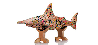
Skateboard Sculptures

3D sculptures take life from old skateboards. From toys, to sharks to fire hydrants, Japanese artist Haroshi. Through his teenage years Haroshi was an avid skateboarder and was very familiar with the different parts of the board. "Without skateboarding I am nothing," Haroshi says. It was only natural that he was partially emotionally attached to holding on to his old boards and took to collecting other peoples pieces of their boards as well.
The way that he goes about making the sculptures is by finding decks that fit together then cutting, shaving and polishing them. What stands out for me is the vivid colours and the fact that all of his creations are from recycled material. 
These are a few of my favourite pieces of his:


Click here to see and interview with Haroshi about how his boards are made: Interview
Information and pictures from: http://haroshi.com/artworks/

Language Book


The outline for the language book project was to create a 24page book, with a minimum of 12 illustrations. The book had to be in a language that was foreign to us and the pictures had to clearly depict the type. I decided to do a book in German using the illustration style used to make Dora the Explorer. Instead of Dora and Boots the main characters are Klara ad Klaus, a German girl and her pet rabbit. In their adventure they would wake up on a sunny morning and go to the zoo and see different kinds of animals.
At the beginning it was smooth sailing, I sketched out 12 drawings, this is an example:
The problems began to occur when I brought the sketch into the computer. Vectoring the sketch made it look flat and lifeless.
To fix this problem I decided to chose a colour palette and to first draw the illustrations in pen and ink, scan it in then colour it in Photoshop.
 This was getting more towards what I wanted my illustrations to look like but I still wasn't happy with the final result. The colours were too muddy and the style started to look less like Dora the Explorer with the outlines in ink. From this I decided to change the style completely. With the help of a classmate I came across a designer, Ty Wilkins who's style was very simplified using basic shapes and minimal colours. This is an example of his work:
I then went on to colourlovers.com and found a colour palette. I added and changed a few colours and decided on a palette of white, blue, dark brown and two yellowy mustard colours. Using basic shapes, circles, squares, triangles ect. I created simplified scenes and animals. These are some examples of the finished illustrations:


Wednesday, 15 February 2012

Installation Art

Installation Art is a large piece of modern art that can be indoors or outdoors that evokes emotion from the viewer. It can be interactive and involve more than just the sense of sight. It is most commonly absurd and makes the viewer curious.
I have come across numerous art installations that have caught my eye:
1. San Gennaro North Gate


Created for a festival by SOFTlab this art installation is created out of 4224 laser cut panels that together for a structure with two oculus'. It is held together with 6000 aluminum grommets and is suspended with wire cable to the surrounding buildings. It was made for this specific site and will only take its true for when attached to the proper buildings. The festival is called "The Feast of San Gennaro" and takes place in Little Italy. It is a celebration to commemorate Italian immigrants coming to America looking to improve their lives.

2. Waste Not
 
Over 10,000 everyday objects from one Chinese woman's life were displayed at the MoMa. This installation told a story of her 50 years of life and was spread over an entire floor. From empty toothpaste containers to shoelaces and everything else in between, these various objects show just how much we as humans use in a lifetime. "Waste not" was a Chinese Communist saying to encourage people to reuse things, this installation is also a reminder of how we treat our planet and how much waste we throw away.

3. RGB Wall
 
 In normal light this wall looks like a collage of animals in multicolours but in red, green or blue light the wall transforms so that only specific animals from particular time periods are seen. Created by Carnovsky, the lighting also triggers a different psychological state depending on the colour ie. red for wakefulness.


http://softlabnyc.com/news/?p=1541
http://dornob.com/rgb-wall-art-murals-shift-scenes-as-lighting-color-changes/

Tuesday, 14 February 2012

Colour Report

Being in the midst of fashion week in New York, Pantone has released their fashion colour report for fall 2012. The one colour that has stuck around from last season and the trendiest colours of 2012 is Tangerine Tango. It is exotic and bold but yet works well with other colours and isn't too over the top. In the past few years the colour of the year has varied in colour, last year was Honeysuckle, an inviting colour of pink, and the year before that was turquoise, a soothing and tropical colour.
 From the past spring season of pastels mixed with neons comes neutrals mixed with brights and even a few darks. For men and women the common colours are honey gold, french roast, olympian blue, tangerine tango, bright chartreuse, titanium and ultramarine green. For men the one of the top fashion colours is rhubarb.
The common trend of this season in deep natural colours with pops of bright yellows, oranges and pinks. Fashion experts are predicting to see deep jewel tones in makeup, thicker more natural eye brows, disheveled hair and messy braids. The fashion experts have also said the fashion don't for this season is duck billed nails where the nails get wider towards the tip.
These are a few examples of outfits using Pantones fashion colours for fall 2012.


Missed fashion week this February? No need to worry, September 6-13th is Fashion week again for spring/summer of the following year.

Information from:http://www.pantone.com/pages/fcr.aspx?pg=20948&ca=4

Sunday, 5 February 2012

Criticism


After the completion of my first project, my beer logo I asked multiple people for feedback. Overall the conclusion that I arrived at was that it was not very strong aesthetically. There were a few positives such as the name that I had chosen was a good choice and the typefaces that I used worked. As well the larger beer bottle that I had chosen worked with the over all target audience of American men. The constructive criticism that I received was that the artwork looked to flat and wasn't visually interesting enough. To solve this I could add some crosshatching to the skull, over lap the text and the image or use a different picture of a cow skull. Secondly there were too many competing elements to the logo, the lines crossing in the background over the text, the colours against each other and the texture.
Since it seemed that there were more negatives than positives and many of my label elements weren't working I decided to keep the name, scratch everything else and start fresh. To connect my brewing company, Lone Star Brewery, and the particular brand of beer together I have decided to change the shape of the logo to a similar Texas ranger badge shape.

The colour pallet that I am now using is changing from blue, red and silver to white, black and red to give the label a more professional and sleek look. Half of the new logo is done by hand and the type is computer generated. In the back I added a texture so that the elements tie into each other better. The new final product looks like this:


I feel that this is a much more successful approach than my first. What do you think?